


The long-standing debate over operating system aesthetics often places Apple’s macOS on a pedestal for its clean, minimalist design. Windows, by contrast, is frequently characterized as cluttered and utilitarian. However, this perception overlooks the profound customizability inherent in the Windows ecosystem. With a series of targeted, simple adjustments, it is not only possible to match the polished look of macOS but, in some respects, to surpass it. This exploration delves into four fundamental tweaks that can transform the standard Windows interface into a model of clarity and focus, proving that exceptional design is not exclusive to one platform but is achievable through deliberate user choice.
Introduction to optimizing the Windows interface
The philosophy of a clean user interface
A minimalist user interface is not merely about aesthetics; it is about cognitive load. Every icon, notification, and visual element on screen competes for a user’s attention. By stripping away non-essential components, you create a digital environment that promotes concentration and reduces distractions. The goal is to make the technology fade into the background, allowing the user’s work and content to take center stage. This approach prioritizes function through form, ensuring that the tools you need are accessible without overwhelming your visual field. An optimized interface is faster to navigate, less stressful to use, and ultimately, more productive.
Core principles of interface decluttering
Achieving a clean design in Windows revolves around a few key principles. The first is centralization, consolidating tools and icons into predictable locations. The second is concealment, hiding elements that are not in active use but keeping them easily accessible. Finally, there is consistency, applying a unified visual language across the entire system, from colors and fonts to icon styles. By applying these principles, you can systematically dismantle the visual noise that often defines the default Windows experience.
These principles are not just abstract ideas; they can be directly applied to tangible elements of the user interface, starting with the most frequently used component of the Windows desktop: the taskbar.
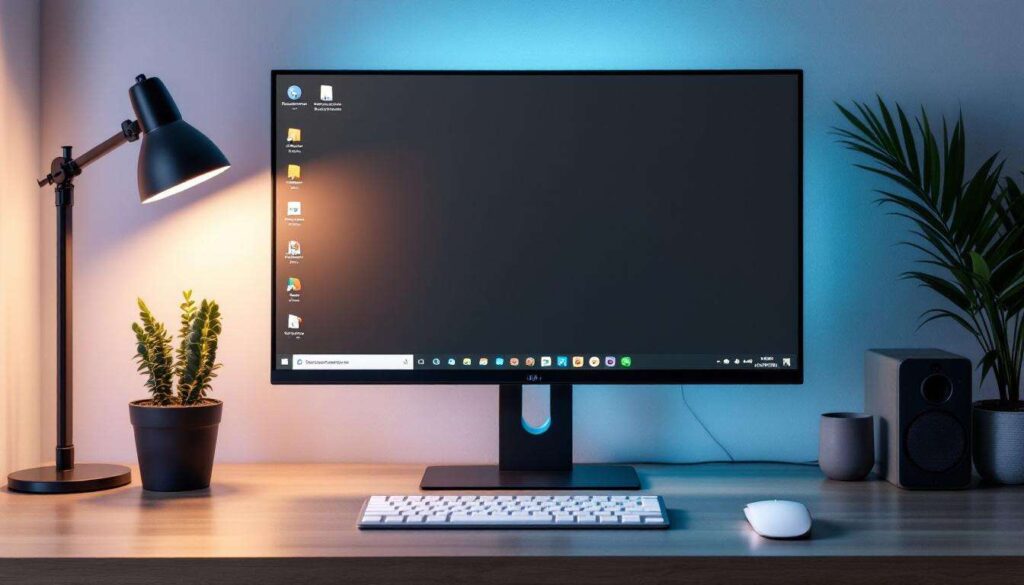
Customizing the taskbar
Centering icons for a modern look
One of the most significant visual changes in Windows 11 was the centered taskbar, a design cue long associated with macOS. This simple shift creates a sense of balance and symmetry. While native to Windows 11, users of Windows 10 can achieve the same effect with third-party utilities. A popular and lightweight option is TaskbarX, which dynamically centers active application icons, providing a clean and modern feel. This small change has a disproportionately large impact on the overall perception of the desktop, making it feel more intentional and organized.
Hiding unnecessary system icons and search
The default Windows taskbar is often populated with elements that many users seldom click, such as the search bar, task view button, and various system tray icons. A critical step in decluttering is to reclaim this space. You can easily modify these settings by right-clicking the taskbar. Consider the following adjustments:
- Search bar: Change this from the full bar to a simple icon, or hide it completely. The search function is still instantly accessible by pressing the Windows key and typing.
- Task view and widgets: These can be hidden via the taskbar settings if they are not part of your daily workflow.
- System tray overflow: Select which icons are always visible and hide the rest in the overflow menu. This prevents a chaotic collection of icons from accumulating in the corner of your screen.
Pruning these elements is the fastest way to achieve a minimalist taskbar. A tidy taskbar not only looks better but also makes it easier to find the applications you are actually using. With the taskbar streamlined, the next logical step is to address the main desktop area itself.
Organizing desktop icons
The ’empty desktop’ approach
For the ultimate minimalist aesthetic, nothing beats a completely empty desktop. A clean wallpaper, free of any iconographic clutter, can create a remarkably serene and focused computing environment. Hiding all desktop icons is a built-in Windows feature. Simply right-click on the desktop, navigate to ‘View’, and uncheck ‘Show desktop icons’. This instantly transforms your desktop from a chaotic file dump into a clean canvas. Files are still accessible through File Explorer, which encourages a more structured approach to file management rather than relying on a sprawling collection of desktop shortcuts.
Using organizational tools
If a completely empty desktop feels too extreme, tools like Stardock Fences offer a powerful middle ground. Fences allows you to create shaded, movable areas on your desktop to group icons automatically. For instance, you can create ‘fences’ for documents, applications, and project files. This tool brings order to chaos without completely removing the convenience of desktop shortcuts. A key feature is the ability to double-click the desktop to hide all fences, giving you an instantly clean view when you need to focus. It combines the benefits of organization with the principles of concealment.
Once the primary desktop and taskbar are in order, you can delve deeper by altering the fundamental look and feel of Windows with custom themes.
Using custom visual themes
Finding and installing third-party themes
While Windows offers basic light and dark modes, the true potential for a visual overhaul lies in third-party themes. Websites like DeviantArt are repositories for custom themes created by a vibrant community of designers. These themes can alter everything from window borders and title bars to system icons and fonts, allowing you to achieve a cohesive aesthetic that rivals the uniformity of macOS. Installing them often requires a patching tool like UltraUXThemePatcher, which modifies system files to allow non-Microsoft-signed themes. While this requires caution, the results can be transformative, allowing for a truly unique and clean desktop experience.
Leveraging dynamic desktop tools
Beyond static themes, applications like Rainmeter unlock another level of customization. Rainmeter uses lightweight ‘skins’ to display information and provide functionality directly on the desktop. You can add minimalist clocks, weather widgets, system monitors, and even application launchers that perfectly match your chosen aesthetic. This allows you to replace cluttered system tray icons with elegant, integrated desktop elements. For example, instead of a busy taskbar, you could have a simple, text-based dock created in Rainmeter. This turns your desktop from a passive background into an active, functional, and beautiful workspace.
With the visual appearance refined, the final step involves fine-tuning the native Windows settings to eliminate any remaining visual noise and enhance the clean design.
Optimizing Windows settings for a clean design
Disabling transparency and animations
Windows employs various visual effects like transparency for the taskbar and start menu, as well as animations for opening and closing windows. While intended to create a sense of depth, they can also contribute to visual clutter. For a cleaner, more solid look, you can disable these effects. Navigate to ‘Personalization’ > ‘Colors’ and turn off ‘Transparency effects’. Then, go to ‘System’ > ‘About’ > ‘Advanced system settings’ > ‘Performance’ > ‘Settings’ and choose ‘Adjust for best appearance’ or manually uncheck animations you find distracting. This creates a flatter, faster, and more minimalist interface.
Streamlining the start menu and notifications
The Start Menu can be a major source of clutter, filled with suggested apps and live tiles. Take a moment to unpin everything you do not use regularly. Group the remaining tiles into logical, unnamed categories for a cleaner look. Furthermore, managing notifications is crucial for maintaining focus. In the ‘System’ > ‘Notifications & actions’ settings, you can turn off notifications from non-essential apps and disable tips and suggestions from Windows. A quiet and curated notification system is a cornerstone of a distraction-free environment.
By making these internal adjustments, the transformation is nearly complete. The resulting Windows environment is now ready for a direct visual comparison with its main competitor.
Visual comparison between optimized Windows and macOS
Feature-by-feature aesthetic breakdown
When placing an optimized Windows desktop alongside a default macOS desktop, the similarities in design philosophy become apparent. Both can offer a clean, centered application dock or taskbar, a clutter-free desktop, and a consistent visual language. The key difference shifts from a default advantage for macOS to a user-defined advantage in Windows. The customizability of Windows allows for a level of minimalism that can, in some cases, exceed that of the more rigid macOS environment. The table below outlines a direct comparison of key visual elements.
| Interface Element | Default macOS | Optimized Windows |
|---|---|---|
| App Launcher | Centered Dock at bottom | Centered Taskbar at bottom |
| Desktop | Clean by default, supports icons | Can be configured to be completely empty |
| System Icons | Located in top-right menu bar | Consolidated in system tray overflow |
| Window Appearance | Uniform, rounded corners | Highly customizable (borders, colors, fonts) |
| Transparency | Subtle transparency in Dock and menus | Can be enabled or completely disabled |
Subjectivity and user preference
Ultimately, the “cleaner” interface is a matter of personal preference. However, this exercise demonstrates that the argument is no longer about which system is inherently cleaner out of the box. Instead, it is about which system provides the user with the tools to create their ideal environment. While macOS offers a beautifully curated experience with limited deviation, Windows provides a canvas that can be tailored to an individual’s precise definition of clean and efficient design. The ability to hide, move, and theme virtually every element gives Windows a significant edge in deep, personalized customization.
By taking control of the taskbar, desktop, themes, and settings, Windows can be sculpted into a workspace that is not just functional but also visually serene. The result is a user interface that feels less like a default configuration and more like a deliberate, personal choice.